Your customers are not sitting at a desk when they find you. They are on the 6 train, standing in line at a coffee shop in Midtown or sitting in a parked car outside their kid’s practice in Scarsdale. They search, tap and decide, all with one thumb. If your website was designed on a big monitor and only later squeezed onto a phone, those customers feel it immediately.
Mobile-first means designing for that phone experience first and treating the desktop version as the bonus. Google works the same way: it primarily looks at the mobile version of your site when deciding how to rank it. This post gives you a practical phone test to run on your own site and the fixes that make the biggest difference.
- Your mobile site is your main site, for customers and for Google.
- Calling, booking and finding your address should take one tap.
- Speed, readable text and short forms matter more on a phone than anywhere else.
- Test on a real phone, on cellular data, not just a shrunken browser window.
Why “it works on mobile” is not enough
Almost every modern website technically works on a phone. The layout stacks, the text wraps and nothing is cut off. That is the minimum. The real question is whether a stressed, busy person can get what they need in a few taps without zooming, hunting or giving up.
Technically mobile
- Desktop layout stacked into one long column
- Phone number as plain text you cannot tap
- Tiny links packed close together
- Ten-field form that is painful to fill in
Truly mobile-first
- Most important content at the very top
- Sticky tap-to-call and book buttons
- Large, well-spaced buttons for thumbs
- Three-field form with the right keyboards
The ten-minute phone test
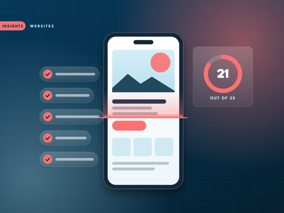
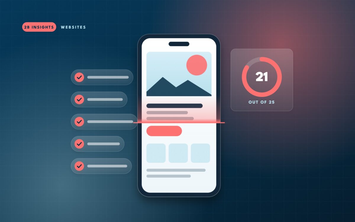
Grab your own phone, turn off Wi-Fi so you are on cellular data, and open your website as if you were a new customer. Go through this list honestly.
- The page shows something useful within about two seconds.
- Without scrolling, you can tell what the business does and where.
- You can call the business with one tap from the top of the page.
- Text is readable without pinching to zoom.
- Buttons and links are easy to hit with a thumb, without tapping the wrong one.
- No pop-up covers the screen on arrival, or it closes easily.
- The menu opens, closes and is easy to navigate.
- The contact or booking form can be completed in under a minute.
- The address opens in your maps app with one tap.
- Nothing scrolls sideways or gets cut off at the edges.
If you checked eight or more, your site is in good shape. Five to seven means real customers are getting frustrated. Fewer than five means your mobile site is probably costing you calls every week.
Fix 1: Put the most important action in reach
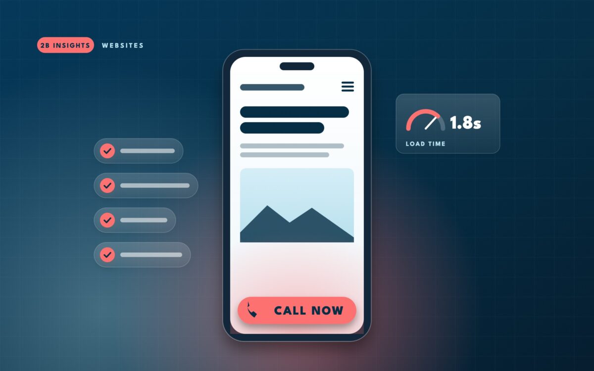
On a phone, people hold the device in one hand and tap with their thumb. The bottom of the screen is easy to reach. The top corners are not. That is why many strong mobile sites use a sticky bar at the bottom with one or two actions such as “Call” and “Book.”
For a restaurant, the actions might be “Reserve” and “Menu.” For a contractor, “Call” and “Free estimate.” For a medical office, “Book” and “Directions.” Pick the two that matter most and make them impossible to miss.
Fix 2: Make it fast on real connections
A page that loads instantly on office Wi-Fi can crawl on a subway platform. Images are the most common culprit: a single photo uploaded straight from a camera can be larger than the rest of the page combined.
- Compress and resize images before uploading, and use modern formats like WebP where your site supports them.
- Remove sliders and auto-playing videos from the top of mobile pages.
- Cut plugins and scripts you no longer use.
- Check your mobile score in Google’s free PageSpeed Insights tool and fix the top items it lists.
Quick win: Replace a homepage image slider with one strong photo and a clear headline. It is often the single biggest speed improvement on a small business site, and visitors rarely look past the first slide anyway.
Fix 3: Make forms phone-friendly
Forms are where many mobile visitors give up. Typing on glass is slow, and every extra field is another reason to quit.
| Problem | Better approach |
|---|---|
| Eight or more fields | Ask for name, phone and a short message, then follow up |
| Wrong keyboard appears | Set phone fields to show a number pad and email fields to show the @ key |
| Page zooms in when typing | Use input text of at least 16 pixels |
| Unclear errors | Show what went wrong next to the field, in plain words |
| No confirmation | Show a clear thank-you message with what happens next |
Fix 4: Make it readable
Small gray text on a white background might look elegant on a large monitor. On a phone in sunlight, it disappears. Body text should be large enough to read comfortably at arm’s length, with strong contrast and short paragraphs. Break up long sections with headings so people can scan to what they need.
Fix 5: Respect the small screen
Pop-ups that cover the whole screen, chat widgets that block the call button and cookie banners that take up half the page all stack up on mobile. Each one might seem harmless on its own. Together, they can bury your message. Review your mobile pages with fresh eyes and remove anything that gets between the visitor and the action you want them to take.
Watch out: Many site owners only ever look at their website on a desktop, where they edit it. Make it a habit to check every change on your phone before you call it done.
Fix 6: Make local details one tap away
Mobile searches for local businesses often happen when someone is already on the move. They want to know if you are open right now, how far away you are and how to get there. Put your hours, neighborhood and a “Directions” link near the top of the page, not in a footer they will never reach. If you have more than one location, let visitors pick the closest one quickly. And make sure the details match your Google Business Profile exactly, so a customer never shows up to a closed door because two listings disagreed.
How to know it is working
In your analytics, compare mobile and desktop visitors side by side. If mobile visitors leave much faster or convert at a fraction of the desktop rate, the mobile experience is the bottleneck. Track taps on your phone number as an event, too. Rising call taps after a mobile fix are about the clearest proof you will get.
Most of the fixes above can be done in an afternoon on a modern website. Some sites, especially older ones built on heavy themes, fight back: the theme forces a slider, the form plugin cannot change keyboards, the menu will not behave. At that point the question becomes whether to keep patching or to rebuild with mobile at the center, and that decision depends on what the site is costing you today.
Want a second opinion on your mobile site?
We’ll test it on real phones and real connections, and tell you which fixes would bring in the most calls for the least effort.