Picture someone in Astoria whose kitchen sink has just started leaking under the cabinet. They search on their phone, tap the first three results and give each one a glance. One of those three businesses gets the call. The others never find out they were in the running.
That glance is short. Most visitors decide whether a site is worth their time within a few seconds, long before they read your About page or scroll to your reviews. They are not judging your business. They are judging whether your website makes it easy to believe you can solve their problem. This post walks through what happens in those first seconds and how to make sure your site passes.
- Visitors decide fast, and they decide on clarity before beauty.
- The top of your homepage has three jobs: say what you do, who it is for and what to do next.
- Real photos, visible proof and one clear button beat clever design.
- You can run the five-second test yourself today with a friend and a timer.
What visitors are really asking
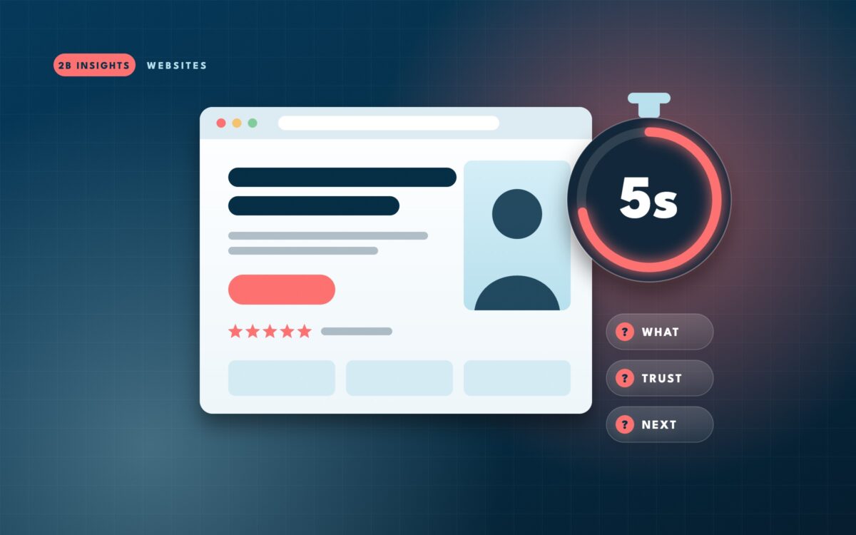
Nobody lands on a small business website thinking about fonts or color palettes. They are asking three quick questions, usually without realizing it:
If the answer to any of these is unclear, most people do not dig for it. They hit the back button and try the next result. That is why a site can look attractive and still lose leads: good looks do not answer those questions on their own.
The three jobs of the top of your homepage
The part of your homepage that appears before anyone scrolls is the most valuable space you own online. It needs to do three jobs, in this order.
1. Say what you do in plain words
Your headline should describe your service the way a customer would describe it. “Excellence in every detail” could belong to a dentist, a contractor or a car wash. “Kitchen and bathroom renovations in Brooklyn and Queens” tells the visitor exactly where they are. Clever lines can come later. Clear lines come first.
2. Show who it is for
Mention your area and your typical customer. A Westchester accountant who mostly works with restaurant owners should say so. A visitor who matches feels instantly understood. A visitor who does not match saves you a phone call that would not have gone anywhere.
3. Point to one next step
Give one primary button with a specific action: “Get a free estimate,” “Book a consultation,” “Call now.” When there are five equal buttons, visitors hesitate. When there is one obvious one, they act.
Fails the glance
- “Your vision, our passion” as the headline
- Stock photo of a handshake
- Menu with eleven items and no button
- Phone number hidden in the footer
Passes the glance
- “Emergency plumbing across Queens, 7 days a week”
- Photo of your actual team or work
- One button: “Call for same-day service”
- Tap-to-call number at the top
Trust is visual before it is written
People decide whether you look trustworthy before they read a single testimonial. A few things send that signal quickly.
- Real photos of your team, location or finished work instead of generic stock images.
- A star rating or review count near the top of the page, not buried at the bottom.
- Logos of associations, licenses or publications you have earned.
- A design that looks current. Sites that look ten years old make people wonder if the business is still open.
- Consistent colors and fonts, which read as attention to detail.
None of this requires an expensive redesign. Swapping three stock photos for real ones and moving your reviews higher can change how the whole page feels.
Quick win: Take ten good photos of your team at work on your phone this week, in daylight. Real faces outperform polished stock images for most local businesses because they prove you exist.
Speed is part of the first impression
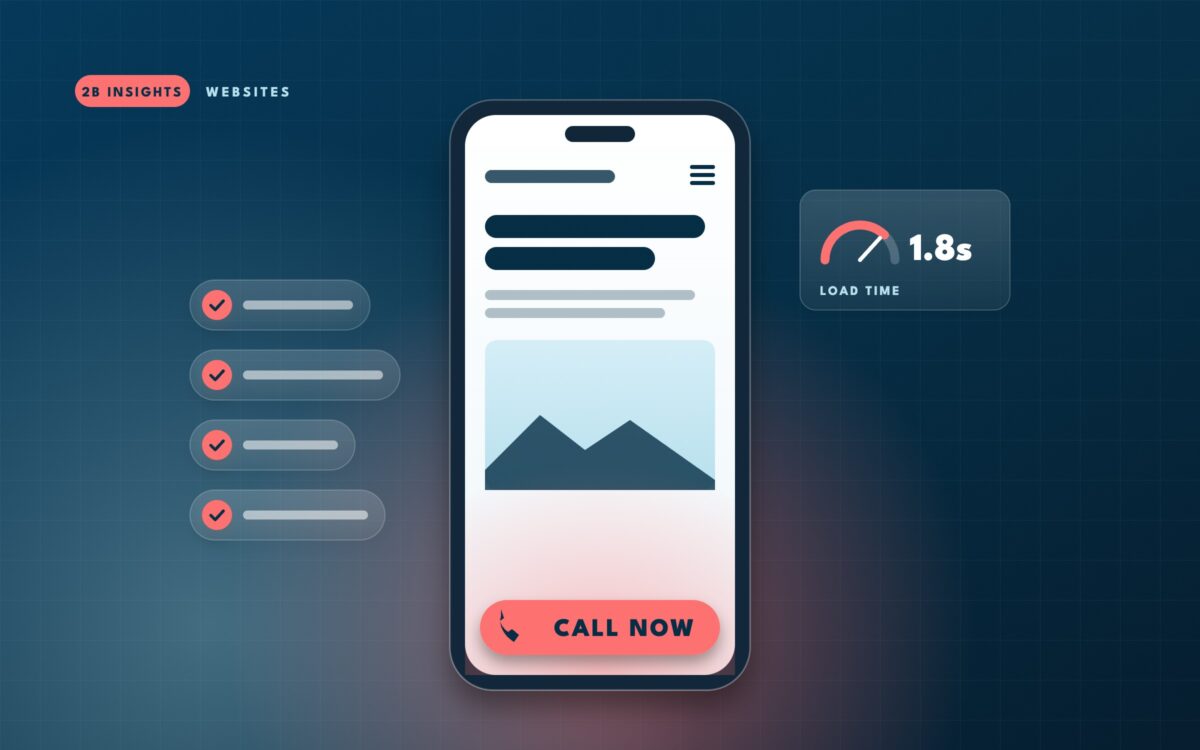
A first impression cannot happen if the page has not loaded. Every extra second of a blank screen gives the visitor time to go back and pick someone else. The usual causes are not mysterious: oversized images, too many plugins, sliders that load five large photos at once and cheap hosting.
You can check your own load time for free with Google’s PageSpeed Insights. Pay most attention to the mobile score, because that is where most local searches happen.
Run the five-second test yourself
This is the simplest usability test there is, and you do not need any software for it.
Ask a friend or neighbor who does not know your business well. Family members know too much.
Open your homepage on a phone, let them look for five seconds, then take it away.
What does this business do? Where? What would you click first?
If they cannot answer all three, the page is not doing its job yet. Repeat it with two or three people. When everyone gives roughly the same answers you were hoping for, you have passed.
The most common first-impression mistakes
When we review small business websites, the same handful of problems shows up again and again.
| Mistake | What visitors feel | Simple fix |
|---|---|---|
| Vague headline | “Is this what I need?” | Name the service and the area |
| Auto-playing slider | Distracted, slowed down | One strong image and message |
| No visible phone or button | “How do I reach them?” | Sticky call button on mobile |
| Pop-up on arrival | Interrupted before they start | Delay it or remove it |
| Outdated design | “Are they still in business?” | Refresh photos, fonts and spacing |
Design still matters, just in the right order
None of this means design is unimportant. Good design is what makes clarity feel effortless: generous spacing so the headline stands out, a color for your main button that nothing else on the page uses, type that is easy to read on a small screen. The point is that design should serve the three questions, not compete with them.
A useful way to think about it is that clarity gets people to stay, and design gets them to feel good about staying. You need both, but if you have to choose where to start, start with clarity. A plain page that answers the right questions will outperform a beautiful page that leaves people guessing.
Watch out: Redesigns that start with “make it look modern” often end with a prettier version of the same unclear message. Write the headline, the audience line and the button text first, then design around them.
Where to go from here
Start with the test. It costs nothing and it will tell you more about your homepage in ten minutes than most analytics reports. Fix the headline and the button first, then the photos, then the speed. Many businesses see more calls from these changes alone.
The harder part is usually deciding what to say. Choosing the one service to lead with, the one audience to speak to and the one action to ask for means making trade-offs about your business, and that is where an outside perspective tends to help most.
Curious how your homepage does on the five-second test?
We’ll run it with fresh eyes and tell you exactly what a first-time visitor sees, what they miss and what we would change first.